
The Twenty sixth Letter — Z
The all inclusive expression “from A to Z” would not have meant much to the Phoenicians or the Ancient Greeks. In their alphabets the Z was the sixth or seventh letter, respectively. Even the Romans didn’t have a Z at the end of their alphabet until around the first century BC. The 26th letter of our alphabet was the seventh letter in the Semetic alphabet. They called the letter Za (pronounced zag” and drew it as a stylized dagger. The Phoenicians used a similiar graphic sign, which they called zayin which also meant dagger or weapon in their language. Roughly the same symbol is also represented in other cultures, with the same meaning. Around 1000 BC the Phoenician zayin became the Greek zeta. The Greek character, while looking more like a dagger than the Phoenician zayin, did not look like the Z we currently know. Actually it looked more like our capital I.
The Romans incorporated the zeta into their alphabet, but since the sound was not required in their Latin language, they eventually dropped it, giving the position in the alphabet to the letter G. In fact, the only reason the Z is in our present day alphabet is because the Romans had to bring it back because of the use in so many Greek words. Because it was not part of the traditional Latin language, the letter was relegated to the last spot in the alphabet hierarchy.
The Romans used a modified version of the Greek zeta in their Monumental Inscriptions, although there is not one to be found in the famous Trajan Column. It was only when the letter was written by scribes and calligraphers that the top and bottom strokes began to be offset from each other and connected by what became a diagonal, rather than a vertical stroke. This design change was probably made because it was quicker and easier to write hat way. The lowercase z is just a smaller of the capital Z for the same reason.
Structure
Although many people might not notice it, the Z takes on two forms. If drawn with a chisel shaped pen or broad flat brush, held in a natural position, the horizontals would be thick and the diagonal would be thinner. But many designers and lettering artists find this horizontal emphasis unsatisfactory, and the resulting weak middle stroke attractive, and as a result draw the letter in such a way that may be technically incorrect, but to their eyes, optically more comfortable. Most serif typefaces are drawn in this modified design.
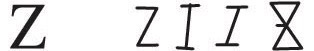
The Z is not a square letter, but is about 3/4 as wide as it is tall. The horizontal strokes are usually the same length, but in many designs the top horizontal is drawn just slightly shorter than the bottom to give the character a firm foundation on which to rest. In Roman versions of the letter, the Z is pretty much left to its own devices, so it tends to be one of the more conservative letters. In Italic designs, however, the type designer quite often takes a little creative freedom and draws the lower horizontal with a slight flair, or even a full fledged swash.
With credit to Allen Haley, Upper & Lower Case magazine, a typographic centered publication last published from 1970 to 1999.
