
The Twenty fourth Letter — X
Some could contend that the letter X really unnecessary. Fewer words in the English language start with X than with any other letter, and its sound is duplicated by the Z or KS combination. The Phoenicians did not use the sound of X, and many scholars contend that the Greeks did not employ the letter to represent phonetic sound. Even the Romans were not exactly sure where to use the letter, so they relegated it to the very end of their alphabet.
The Phoenician ancestor to our X was a letter called samekh meaning fish. Although some historians maintain that this character more likely represented a post or support, with a stretch of the imagination the drawn character could also be seen as the cortical skeleton of a fish.
An X letter did not exist. The Phoenician alphabet adopted by the Greeks. When they took over his system they had no use for all of the Phoenician sibilant letters so they only took those letters which represented sounds that they required. Three Phoenician sound values that were difficult for the Greeks were shin (sh sound), trade (tsk sound), and the samekh (which represented a sharp sound). None of the Phoenician letters represented the soft s sound that was common to the Greek language, so they chose letters which came close and modified their value slightly. The Western Greeks chose the Phoenician trade and renamed it San, and attached the sound value offs to it, while the Eastern Greeks took the Phoenician shin, called it sigma, and gave it the sound of sh. The letter samekh became the Greek xi, but had different sound values in the eastern and western Greek alphabets.
The Romans adopted the X sound from the Chalcidian, or western Greek alphabet, but gave it he design of the chi (two diagonally crossed strokes), a letter added into the eastern Greek alphabet about 500 BC. The Monumental Roman letter became the prototype for both the capital and lowercase X we use today.
Structure
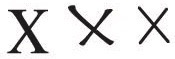
The X is not drawn as a true symmetrical letter. If it was it would appear to be upside down. As with most letters it is constructed in such a way as to appear to look “correct”, when mathematically it may not be.
Actually the diagonal strokes cross just above the true center, making the upper part smaller than the lower. This gives the character a firm foundation upon which to rest, and helps move the eye horizontally across the page. In serif font designs the 7:00 to 1:00 stroke is lighter than the other diagonal, and is usually more oblique than the other heavier one. This makes things look right visually.
Since the X is not a wide letter, it should be drawn only about 1/2 to 3/4 of its height. If it is drawn widely it ungainly and subsequently hampers he smooth flow of reading. While Xs are constructed of only two diagonal strokes there is still a wide variety of designs. Some characters look like crosse Ls and others can look like flipped Cs.
With credit to Allen Haley,
Upper & Lower Case magazine, a typographic centered publication last published from 1970 to 1999.
